
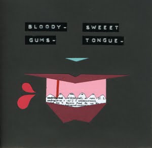
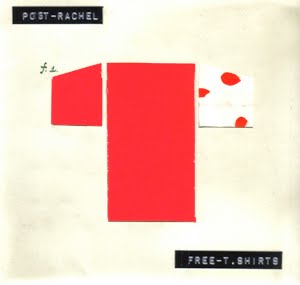
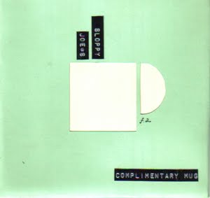
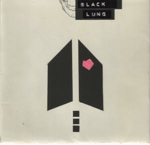
Sean Carter appeals to nostalgia. As if the Blueprint 3 were actually an album like any that we grew up listening to. As if this album were prolific enough to reinvent the #3. But again, I must concede to his genius. The album cover is a nod to movements of geometric art in our contemporary media design. I, personally, was inspired by the color palette. If Jay in fact had total creative control--without the assistance of marketing analysis and a team of graphic designers--I would be impressed. But of course, as we should all know by now, every artist hits a certain quantifiable crescendo. What this album lacks in hunger and lyrical quality (Reasonable Doubt/The Blueprint)--it makes up for in "old man hustling an easy crowd" style. The album, with all of its resources, promises to be something of a masterpiece.
So Brooklyn...he did it himself. Yes.

.jpg)
.jpg)
.jpg)
.jpg)
.jpg)


No comments:
Post a Comment